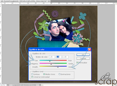
Sometimes we got wonderful pics but their color don't match with the kit palette that we want to use. But don't worry, it is not a problem. All you have to do is follow this tutorial to know how to improve your layouts.
1.- Create your layout, don't worry about the pics: place them where you want.
2.- Now, rasterize the image and select it. Go to Image > Adjustment > Color balance...
3.- This is the box that we will see: Cyan / Red. Magenta / Green. Yellow / Blue.
4.- Now, you have to decide and adjust the color balance. Does your image have more cyan or red? My layout has cyan, so I move the arrow which is in the middle of the bars. Does your image have magenta or green? Mine has few reds, but a lot of lilac, so I pick magenta. Has it yellow or blue? My layout has a lot of blue!
Then just save :) Easy, isn't it? I hope you learned a bit with this tutorial. See you soon girls! Credits about the layout kit and template, here.


No comments:
Post a Comment
I love comments and I read them all. You can leave a comment with some love, questions or request :) Please, do not use it for SPAM, I delete those comments.